[Away Will You Take It] a`Word `Word `Word (of) Miracle(s) for Gut Health, Ima-Abasi Okon
<Verse 1>
GOLD, CLAP, ROMANCE, CALL, RESPONSE, ASPIRATION, FAILURE, DELIVERY,
WORD-WORD-WORD, WEIGHT, WORD-WORD-WORD, PRODUCT, BOOTY,
MORE GOLD, ARRIVAL, COLLABORATION, SYSTEMS, INVESTMENT, HOME,
HOME FORM HOME, FAMILY, YOURS, MINE, OURS, EXPORT, WORD-WORD-WORD,
EMBODIMENT, SLICK, BUY, SELL, TO-LET, OPTICS, LESS GOLD, STONE,
WORD-WORD-WORD, STOCK, PEDIGREE, BASS, 12-BAR, REVIVAL, MAN,
WORD-WORD-WORD ( ... )
<Bridge>(contested) relationship between culture (living i-r-r-e-d-u-c-i-c-i-b-l-y-), political economy (policy:bodies), immaterial
production and the public realm:
<Chorus> #0000EE
1 How do you get this information?—
2 just comes to you ...
3 this stuff just flies through the air...
4 They send this information as images beamed out all over the ‘--------’ place SELAH
5 and you just have to know how to grab it
6 Just know how to grab it1
<Verse 2>
SO-and-SO that does not do SUCH-and-SUCH is a culpable ripeness: DA JUICE DA JUICE!
WHat WHat !!! CONSUMER Consommé, WORKER PRODUCER, SIEVE IN A REDUCTION.
NEW COMPLEX TRI-ELECTIC FUNCTIONS¡¡¡ WHat WHat? SLOOOOOOOOOOOOOW ( ... )
<Bridge>a—p a s t n e s s; site of re-elaboration? WORD WORD WORD¡¡¡:
<Chorus> #0000EE
1 How do you get this information?—
2 just comes to you ...
3 this stuff just flies through the air...
4 They send this information as images beamed out all over the ‘--------’ place SELAH
5 and you just have to know how to grab it
6 Just know how to grab it2
<Bridge>
Sustained dialogue and relations with the BACK(ground) x n% foreground occupation; infra depth of field (of miracles)
<optional>< Bridge> < zero breathe in your diaphragm>
Anticipatory Syntax complexities drives “The will have been— An accounting for that which is an account of was and is
and can be and will have”
<Verse 3>
Strain a solid from a liquid but I am told to reverse it;
4 YOUR SERVICE 4 YOUR SERVICE 4 YOUR SERVICE
4 YOUR SERVICE 4 YOUR SERVICE 4 YOUR SERVICE
4 YOUR SERVICE
4 YOUR SERVICE-for your service- Before-the-world flesh3 is what I am after, after after ( ... )
EVERY DAY
EVERY HOUR
EVERY DAY
EVERY HOUR, you can call on my love
My before- the-world- flesh
<Chorus> #0000EE
1 How do you get this information?—
2 just comes to you ...
3 this stuff just flies through the air...
4 They send this information as images beamed out all over the ‘--------’ place SELAH
5 and you just have to know how to grab it
6 Just know how to grab it4
EVERY DAY
EVERY HOUR
EVERY DAY
EVERY HOUR, you can call on my love
My before- the-world- flesh
4 YOUR SERVICE 4 YOUR SERVICE 4 YOUR SERVICE 4 YOUR SERVICE
EVERY DAY
EVERY HOUR
EVERY DAY
EVERY HOUR, you can call on my love
My before- the-world- flesh
4 YOUR SERVICE 4 YOUR SERVICE 4 YOUR SERVICE 4 YOUR SERVICE
[sic]
(Theo Adorno disliked Jazz)(Damn)
Endnotes
1 1-6; https://www.youtube.com/watch?v=oG_G6rZHp1A accessed Monday 20th July 2020. Link directs you to a 0.19 minute clip showing character A interacting with Character B. Described as Character A buying a score from Character B. The scene is from Michael Mann's Heat, the 1995 film starring Robert De Niro and Al Pacino as rivals (cat and mouse) on either side of a (not the) law.
2 Ibid.
3 Before-the-world flesh is a hoped for subjectivity that is not a result of subjectivation. This subjectivity is not one yielded by capture— a mechanism deployed by the World (the current organisation of capitalist logic). We wait desperately for the Earth and what its un-worlding brings to those that are unthought.
4 1-6; https://www.youtube.com/watch?v=oG_G6rZHp1A accessed Monday 20th July 2020. Link directs you to a 0.19 minute clip showing character A interacting with Character B. Described as Character A buying a score from Character B. The scene is from Michael Mann's Heat, the 1995 film starring Robert De Niro and Al Pacino as rivals (cat and mouse) on either side of a (not the) law.
Antonia Carrara, Benjamin Thorel-Takeaway-Report
Dear all,
It may be a bit corny to send you a letter as a “book review” — but it felt livelier to write than a “formal” commentary. Let’s do as if we could look up at you, sitting around us as we browse it. Well, no — this wouldn’t be a very comfortable situation . . . your 23 pairs of eyes on us as we read your work . . . One of the best things with books is that they’re made to be enjoyed privately, aren’t they? tAkEAwAY, as you say. Your book was too thick for our Summer pockets, but it was light enough for our bags, and it sits well in one’s pair of hands, opening gently in spite of the number of pages.
Actually we’re reading your book “on holidays,” far from our bookshelves & our bookshop. Thus the context in which it was made fades away: it is more of an autonomous book, a compendium of works, texts, images, that we’re browsing without paying much attention at first to the authors’ names or “authority.” It gives, indeed, more power to the forms, the words, and the pictures you chose. The book form gives more presence to you as a collective “voice” in print.
As bookshop people, we know that one of the nice things with books is that they call for discussions, small talks, chitchat. They’re part of the social fabric of daily life that the health crisis has struck such hard blows to. And making them — designing them — makes sense when it is not just a job, but also a process, a time-based work, an actual collaboration. Working “together” most of the time means a mix of phone calls, meetings IRL, hanging out — and also online work, sharing files, ideas, corrections, as well as jokes, references, and random stuff. Isn’t it actually what your book contains? Work, individual and collective; and more than that, or less that this.
Because of the circumstances, it seems that a lot of what’s in your book comes from your private rooms and it feels legit, then, that it reaches us in our own private spaces. The diary-like quality of most of the “chapters” makes it, we feel, more of a book to browse, to use, than to read. Almost like consulting the I Ching we end up taking your volume and opening it at random, reading the page we’ve found as if looking for some omen, or some oracle. This way of “using” your book, rather than “reading” it, is related to the fact that its polyphony makes it somewhat opaque.
Don’t take us wrong: we don’t conceive of opacity as a flaw. Opacity provokes attention; it suggests that access isn’t given; that meaning is to be created while looking for it. Opaque design: the pages of tAkEAwAY rarely have a grid, or a structure that superimposes its logics to the reader; more often do they present themselves as free spaces where elements are distributed in a dynamic, nonhierarchical, multi-layered, way. The idiosyncratic, fragmented model of the jotted notes often appears, in the guise of fake/real sticky notes, text typeset as if notes taken during a class, fonts recalling the swift movement of the wrist more that the punch of the press, scrapbook-like collections of pictures, or bits of ideas that become, when printed, bold statements. Nothing is transparent — this is the best background for things to appear: if opaque, your pages are indeed open-ended. Their surfaces form mosaics, off-centered compositions, that compel us to go back to them more than once.
We can feel however a tension in the pages of the book, between the dense materiality of the volume, and visual elements that come from the screens, the clouds, the software with which you worked. It’s a productive tension insofar as you’re twisting default settings to mark relationships and construct meanings. The dialectics is all the more present as most of your contributions are the result of combination of hand-made elements and computer-generated layout; or show work that call for the idea of the hand, even though they’re digitally produced. Drawings, collages, frottages, Xerox-like pictures, a throw of dice . . . Your use of color is also striking: the unconventional hues that streak the pages recall the exuberance of our screens, while they also call for a more stimulating approach to color in print, far from Pantone and CMYK standards. We like how several contributions rely on DIY process too, not taking technology for granted. We like also how you approach documents, with attention to their consistency and eagerness to make them active, urgent.
tAkEAwAY is a pretty exciting collective image of what it is to work today, from drawings to virtual compositions, from library research to experiments with friends, from taking notes to writing an essay. It’s an honest image, that doesn’t aggrandize one’s achievements — but one cast in actual projects, not in an abstract idea of work. Here is a book of work merged with life, neither as a creative utopia, nor as a neoliberal curse; but as a necessity, a self-determined occupation. Working on a book in “lockdown” is a cruel challenge as it means that it’s so difficult to know if what we’ve done has reached anyone.
Obviously one of the nicest things in your book is that you made a point in making it a collective effort, using the process of its making to work together, in spite of everything. We know how, when school ends, the community of students feels suddenly stronger than ever, and then quickly vanishes. It’s moving — yes indeed — to see this book as such a complex and complete picture of a group we’ve never met. Books are strange vectors of intimacy: we liked how your portraits — on which the book close — worked as a sort of visual colophon, for us readers, making you somewhat closer; we also appreciated how they were for you a form of exchange with its own codes, its private meanings, that we can’t share. This is opacity at its best — when the reasons why you made things aren’t fully disclosed, but nonetheless make way to a form that will move the audience.
Somebody said that every book is, in an intimate sense, a circular letter addressed by the authors to their friends. They find private messages, jokes, signs of love, memories, and expressions of gratitude, dropped for them in every corner. But they won’t make its full meaning. Other, unknown readers, will.
Congrats for your work! and maybe see you soon, tAkE cArE,
Antonia & Benjamin
After 8 Books, Paris
James Goggin, Smooth Panic Rietveld Takeaway Review
“Is that it?” This sounds like an unfair way to start my review of the Rietveld Academie class of 2020 publication Takeaway, I know, but I want this review to be an honest account of my responses to the book I talked about with the students on Zoom a few months ago, mid-conception, and then finally received in the mail last week. To start with, upon first hearing David’s description of the publication—“800-plus pages”—I had immediately thought “that sounds big.” 800 pages is a lot. So I naturally imagined a really big book, not just spine-wise, but dimensions-wise too. It was a subconscious thought, I now realise. It just stuck with me and I didn’t question it. I think this happens a lot when it comes to the contemporary experiences we have with physical objects. We see them online, or talk about them. In design practice, we speculate and conceptualise, each project participant often conjuring different unspoken pictures in their minds of the thing being designed. These pictures, and some kind of proprioceptive sense of it in our hands, somehow just sticks. My image was of a telephone book. A Dutch telephone book, I suppose, even though I know they stopped making those two years ago.
We hear a description, or take a quick look at an Instagram square on our phones, and our instinctive sense of an object is formed. And then we’re often surprised. Cleo emailed to say that the book was ready and had just been FedExed. It arrived a week later, I saw the small package on our porch here in Providence, and thought “That can’t be it.” I opened it. “Is that it?” It was it. This is not to diminish the accomplishment of the thing, of course. It’s a delight. But I spent a few seconds in complete disorientation. I had to recalibrate my understanding of the publication from my phone book mental picture to the hand-sized (yet still admittedly doorstop-like) book in my, er, hand. This is why I say my expectation of it was subconscious. I’d never actually told myself “this thing will be huge.” I just assumed it would be.
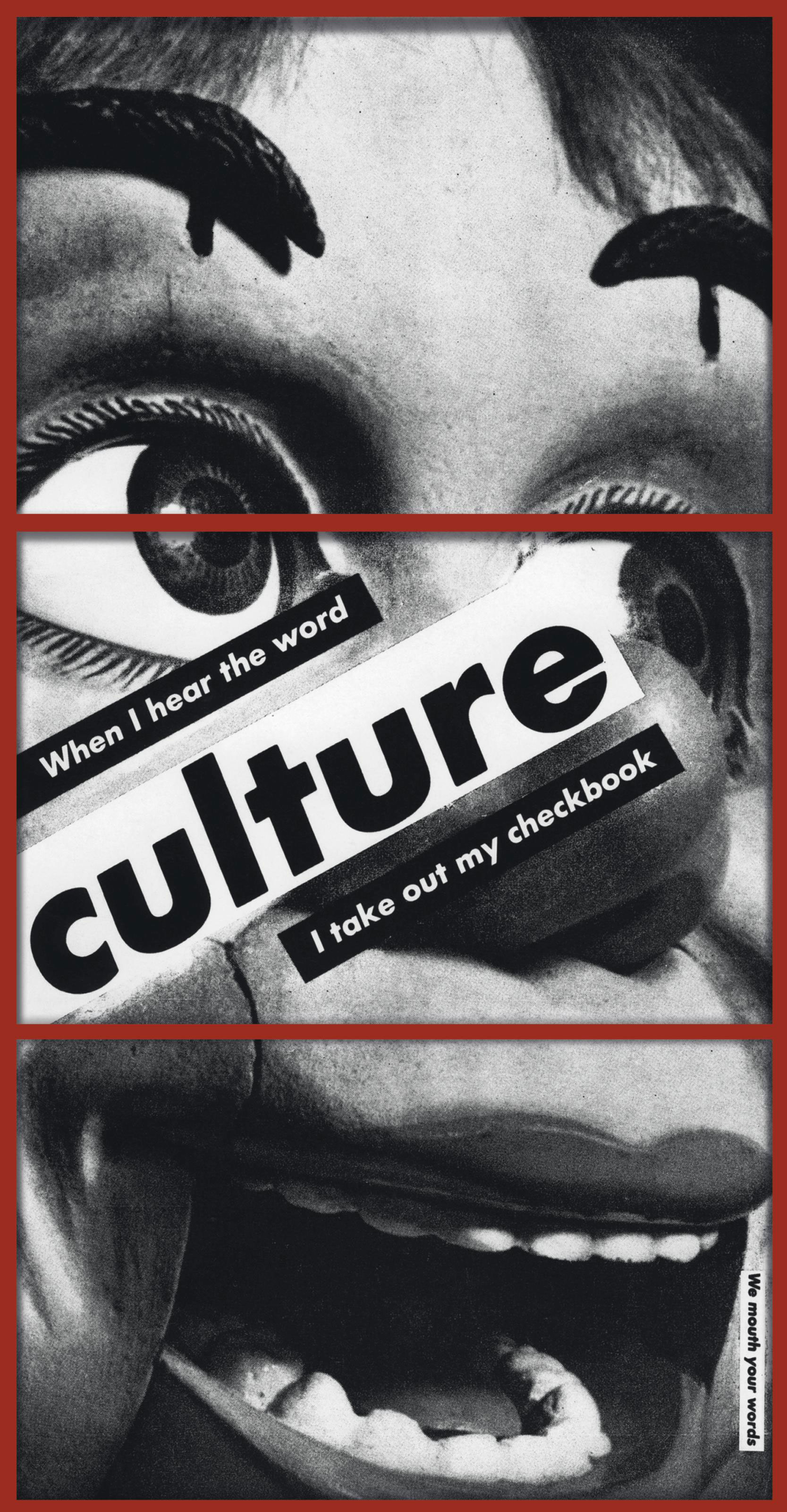
Barbara Kruger, Untitled (When I hear the word culture I take out my checkbook), 1985
Now I’ll admit another assumption. When I hear the words “graphic design student publication,” and, further, “DUTCH graphic design student publication,” I immediately expect discombobulation. I’m sort of paraphrasing Barbara Kruger here (“When I hear the word culture I take out my checkbook”). I expect to be confused, maybe feel a little excluded as a reader. Concern that I won’t know the secret handshake. So this was another subconscious part of my expectations coming into the book. I pulled it out of the envelope. Recalibrated my assumptions to accept it’s smaller than I expected. I took the cover in: jumpy type, scribbles, collage. I do what I think most of us to in the first few seconds of a new book encounter: the subconscious cognitive scan. I check the first page (“Terms… and, Conditions?”) and then jump right to the back. How many pages is this thing? No folio on the last page, but on the second-last page: 383?! Surely not. I flick through more pages: the second page of the whole book at the front is page 386? What’s going on? This part DOES conform to my subconscious assumptions: I’m discombobulated. Those wily Dutch graphic design students!
Let me see if there’s an intro. Now I’m onto you: “The intro won’t be at the beginning of the book,” I think to myself. I’m getting into this, now I’m a step ahead: “I bet they’ve stuck the intro in the middle, in an urgent critical act against the hegemony of codex form linearity!” Solidarity. I’m with you on that one! Checking the fore edge, I spot a white block of pages in what looks like the middle of the book. Facing page 736, here’s page “i”. Bingo! The cover’s “mocking SpongeBob” type continues: look, a contents page! Here we go, a statement facing the title page on p.viii. I like the title, by the way. Takeaway. Er, TAkEAwAY. Was this a subtle Kiwi culinary reference from David? I learn from his intro that the book in my hand represents the “small” of three pseudo-Koolhaasian options. I agree that avoiding “dreaded book-sculpture” scale was a good choice.
The honesty—and embedded hope, in my own reading—of the title spread opening statement is appreciated. A very time and place-specific counterpoint to, or perhaps elaboration on, Ulises Carrión. A “What a Book Isn’t” to his “What a Book Is” opening line in “The New Art of Making Books.”❶ Neither catalogue (are the works thus in flux, incomplete?) nor graduation replacement (a role that so many colleges have sought for what have ultimately been inadequate, depressing even, ersatz digital “experiences”). I quote: “It is (not) a soft landing, a smooth panic.” I (do) think that “smooth panic” sums up my orientation and entry into the book, though. I wouldn’t call the experience described above as frustration, or outright confusion, definitely not exclusion. There was absolute joy in my disoriented exploration of the book, your unorthodox pagination actually providing me with a subtle primer of the book without me actually realising it, a gentle unguided tour from front to back to front to centre. “Smooth Panic,” I like that. (Clearly: I stole it for my essay title here!) It’s something I’d hope to elicit myself with the books we make in our studio. I’m left more with a sense of being credited for my intelligence (a naïve principle that I resolutely stick to as an aim for all of the work coming out of our studio) than being deliberately messed with.
A big question one naturally has with a book: who’s actually behind it? Whose voices am I reading here, where has this come from? After reading David’s introduction (especially his evocation of the “cluster of students entangled to form the shape of a star”) and Michelle and Mark’s poignant and admirably honest endnotes (summing up my aforementioned book feels much better than I could: “a different directness of information conveyance that happens through poetics and complexity”), I flick back and forth, remembering that I’d I noticed some portraits at the back. If my understanding of your “end = middle” pagination is correct, that makes the concluding picture essay the chorus, which in turn designates the intro and endnotes as the coda, transposed to the middle from its traditional conclusion position. This series of palimpsest “pass the parcel” portraits is both playful and poignant. They truly provide a beautiful answer to my “who” question. Like the best choruses, I feel like singing along. There’s a clear sense of camaraderie, the significant disruption and loss felt from the sudden Covid-dispersal, the good humour maintained across video calls, gentle antagonism, a mutual admiration and constructively critical respect for each other.
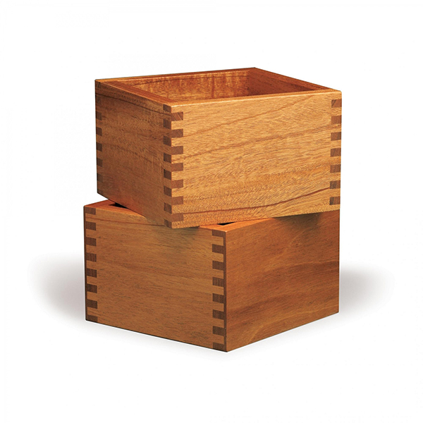
A box joint is a woodworking joint made by cutting a set of complementary,
interlocking profiles in two pieces of wood, which are then joined at right angles, usually glued.
In my talk to you all back in May, I’d grasped at different publication typologies to help you all think about what this book might be: catalogue, magazine, newspaper, or further, website, film? I hadn’t thought about it being a song, and I don’t know if you all necessarily thought of it like this either, but given the choruses and verses intuited above, that’s how it’s gradually (if perhaps obviously) appeared to me. A song with lots of verses, a chorus, a coda, and guest rhymes. With tons of producers. Come to think, maybe the book isn’t just “a song,” but a specific song: maybe it’s the Travis Scott “Sicko Mode” of books. Each 32-page student signature segues in woodworking box joint-style from one verse to the next: abrupt, but maintaining lyrical flow and rhythmic bounce against all odds, given the 23 student producers involved. “Sicko Mode” is a more recent, slightly unofficial, entry in an ongoing informal personal subgenre that to date I’ve catalogued only in my mind: the “Hip Hop Triptych.” In my definition, this encompasses the rare tracks that virtuoso producers casually throw out with three distinct sections, each with its own killer beat that lesser producers would carefully save for just one career-changing track, never in their wildest dreams being so cavalier as to just squander three of them in a row all in one joint. Two benchmarks: west coast producer Madlib’s seminal 3-part remix of slept-on Oakland rapper Zion I’s 1999 track “Critical,” and legendary east coast producer DJ Premier’s masterful self-contained 1994 trilogy “Speak Ya Clout” in his Gang Starr guise with MC Guru (and no less than Jeru the Damaja and Lil Dap on guest mics). I’m sure there must be a (late lamented Detroit producer) J Dilla triptych out there too, to round off an ideal late ’90s “Hip Hop Triptych” triptych, but my casual occasional research hasn’t yet uncovered it. “Sicko Mode” famously had 30 different songwriters involved, and six producers, not just one. So not a strict solo producer triptych, but a worthy contemporary triptych nonetheless. Writer Jonah Weiner laid this all out graphically in a New York Times Magazine article last year,❷ while of course you’ve all just naturally laid it out graphically as the book itself.
So given the 23 students represented across the 800-something pages, this is more of a polyptych: “Sicko Mode” with seventeen more producers in the mix. Some transitions are smoother than others, some fade, some cut. Given the expressed initial “windows” editorial concept, I can’t help pushing my metaphor too far by conjuring the Covid-times videos of various European city lockdown inhabitants singing in unison from apartment block window to window, across dense narrow city streets. Each student section signing and echoing to the next.
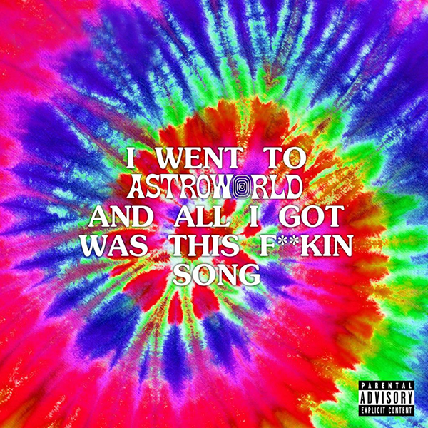
Travis Scott, “Sicko Mode,” Sony Music Entertainment, 2018.
Art Direction & Design: David LaChapelle, Travis Scott. Creative Directors: Corey Damon Black, Travis Scott.
Klara’s notes-based opener functioned as a de facto book introduction for me, until I wised up later in the process of reading. It worked for me, and I’d say it still stands: an introduction of multiple voices, many of whom I’m guessing we encounter throughout the rest of the book. Its title plays that Silicon Valley software and services trick: terms and conditions presented too long and too late, when you’re already in the app. Human bodies and faces have been blurred out: the post-Covid evacuation Rietveld is evoked. Further echoes of college life left behind resonate with Giulia’s impressively illustrated and expertly written/edited photo/typo/graphic mini-catalogue of assignments. Victoria’s high-contrast treatise on the inherent pressure in the phrase “No Pressure” itself provides high contrast between its surrounding sections: the florid “Pressure” cursive is adds suitably uncomfortable pressure at every encounter. Chloé’s “Letter to Letters” adds to the posse track vibe, bringing along her whole synaesthetic anthropometric alphabet crew—“bound together with a special sonic glue.” This is one of the several joyfully illustrative contributions I found from this cohort of graduating graphic designers. Illustrative both in drawings and typography. Eleonora’s diaristic simulacrum survey scrapbook sets a promising course for a critical practice with an eye for surface pattern recognition and anthropological material literacy. Samuel’s picture essay zooming in and out of a grid terrain somehow gave a slight Chris Marker impression, a slightly sci-fi La Jetée-esque depiction of various views, realities that felt simultaneously past, present, and past (“Back to back, future is always behind.”) Camilla’s reverse-timeline detour to Botanical Garden Zuidas is one of several welcome field trips we embark on in the book, places that we might not regularly go to, but suddenly occur to us sitting on our sofas in lockdown, with a sudden pang of regret now they’re closed for the pandemic. Even the flora described here are in quarantine, an actual “plant prison” even, for illicit plants brought into Schiphol by the kinds of careless travellers that can no longer travel.
As I explore the student sections, I find myself going back to Michelle and Mark, and hitting Jim’s “Blindsight” pages, their recollection of David’s observation about the risk of precision in graphic design occluding potentially more valuable noise and complexity. Jim gives us static interference, somehow making visible the less tangible memory imprints you all leave behind upon graduation, the spirits of your presence rendered in rubbings, printouts, photocopies, forever “missing in absentia” as one line tells it, hiding in the (book’s) gutter. If cultural imprints aren’t left embedded in the concrete walls of modernist college buildings, they often end up on t-shirts, and Michelle’s powerful critical anthology of Brandy Melville and Forever 21 (I have teenage daughters, I’ve done time in these worlds) and their algorithmic feminist façade fashions is compelling and made more urgent in its cut ’n’ paste zine form and incisive writing. For some reason it’s only at this point that my eyes light up and I see that of course there is a set of critical editorial hands (all 46 of them?) behind this production: the pacing, juxtapositions, cuts, and transitions between students. We therefore shrewdly move from fast fashion to Etienne’s framework fashion: multipurpose civic clothing borne of chambers of commerce, administrative bureaucracies, pseudo-capitalist housing foundations, and super-capitalist debit card systems. The colourful graphic apparel belies wry critique embedded and their forms and related functions. Yuri cuts in, literally, and does that thing books often do that we often forget books do. That is, snap us out of our reading trance, suddenly making us self-conscious of our semi-hallucinatory state, our hand holding the weight of trees, in this case, accompanied by me clucking my tongue to make sure it’s still there. A deceptively simple photo essay follows, speaking of tongues, birdsong, speakers, diagrams, narration, biblical verse, and myriad ominous surgical blades, scissors, and pliers that cause me to hold my breath before hitting the contents page, a much needed breather!
Pablo snaps my focus back to the book again, and getting into his wonderful fore edge forays, I can’t help double-checking Takeaway’s fore edge in case I’d somehow missed his edgy handiwork on this very book. No such luck, but his supremely enjoyable anecdotal writing style served as a reminder to comment on the remarkable quality of ALL the writing I’ve experienced in the publication. In the meantime, I feel like I’m on the cusp of sussing out the meanings behind all the connections made in Filip’s “International Gathering” pages, looking for clues in the alternative Sgt. Pepper photo collage between Kondo and Corb. I’m enjoying taking my time with these pages, so I’m not going to rush myself and pretend to be any kind of authority on it (please apply this caveat to every bit of the student page commentary above and below while you’re at it!). Equally, I’m looking forward to spending more time with Maxime’s excerpted thesis pages, while admiring his approach of seizing the opportunity of Takeaway to provide a postscript to his exposition of the protest movement against a Nantes regional airport. The airport development occupation Zone à Défendre he described takes on an evolved kind of mobile form in his Clio community reading platform (a literal Renault Clio, not a new Kindle competitor). His activism and community-building endeavours, including Clio’s Covid-inspired pivots to digital and back to public are an inspiration. Meanwhile, Mark-Emil captures the uncanny experience that, as he says, “browsing low-resolution scans in the digital archive” can provide, taking us back in time, tracing the urgent actions of Nazi-occupied Amsterdam librarian in protecting an important socialist/anarchist archive. Visceral pacing of scans, stamps, and space tell a vivid story: like all of the student sections, I’m suddenly transported to other books, other worlds, within this book. A supremely valuable utility while I’m still in more or less Covid lockdown here in the US and my other daily reading skews far too heavily towards constant newsfeed doomscrolling.
Another breather, when Helmer’s brief lyrical snapshot of dice and daily life gets at the weight of fleeting moments, and senses of repetition that are all the more acute for most of us right now. A street scene of old gamblers hit a snag (like we all do every day), but somehow carry on the next regardless. Now I change my grip on the book, with Swani providing us with a ghostly flipbook vision of Maedeh, the Iranian 18-year-old arrested for posting videos of her dancing on social media. Swani’s “Dance Dance Revolution” title points me to the moves transcribed from protest poses recent and past, depicted in grainy duotone press photos, inviting us to join in, paralleling the calls to strike described in the running excerpt from Living My Life, Lithuanian-born anarchist Emma Goldman’s autobiography.
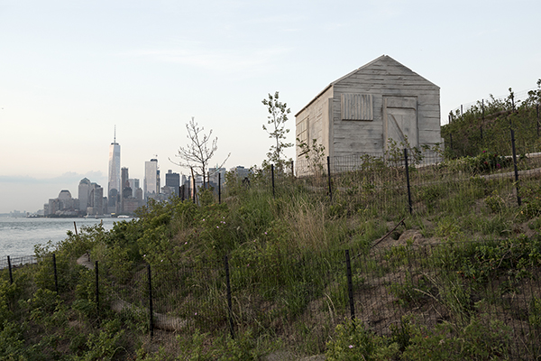
Rachel Whiteread, Cabin, 2016. Governor’s Island, New York
The last few paragraphs are all admittedly brief snapshot descriptions of what I see and how I feel as I explore each student’s section, but if we go back to Michelle and Mark again, their ultimate argument for “slowness”—of transmission, of digestion—more accurately describes my reading process here. Taking time, enjoying obscurity, density, spareness in equal measure. British artist Rachel Whiteread once said something in a New Yorker article about a sculpture of hers—its meaning and its specific position on the newly revitalised Governors Island in New York—that really struck me: “I didn’t want to spell it out, but I wanted you to have a sense of reverie… .”❸ The fear of discombobulation I described earlier has disappeared, and I’ve been reminded of this joy of reverie, being lost in thought, of allowing time for more than blunt spellings out.
As if he heard my thoughts, Youngjin elaborates on this clarity/reverie dichotomy with his section title: “Do I Have to Make Myself Clearer?” His pages float us through a typology of lines: of power, movement, proportion, motion, while his pensive, slightly diaristic flow makes this a more personal, ethereal, fragmented kind of catalogue. Mona’s sudden snap-to-grid transition still maintains the fluidity of Youngjin’s pages, with subtle morphs from matrices to mirages to refractions to messages. There’s an entire career’s worth of graphic vocabulary here. If we manage to make do with just 26 letterforms as predominantly Latin alphabet-beholden graphic designers, surely Mona’s flow grid is far richer. The transition spread from Mona to Alix appears as some kind of decoder at first glance: From dot-to-dot to a-to-z. Alix also seems to work with a matrix, limited to the charged letters e, r, o, and s. Her comprehensive unpacking through loaded anagrams and dimensional forms all constitute a kind of paradoxical constructive (and really engaging) EROSion. Lisa’s pages also constitute a universal unpacking, but of a private lockdown universe that feels very familiar to all of us after the past few months, a constellation of personal spaces and objects in her apartment orbit, revealing the latent autobiographical details that we only stop to discover when we’re forced to stay at home. I’ve found relatable comfort in these personal accounts of places, memories, possessions that are interspersed throughout Takeaway. While I’m still floating in Lisa’s space, Brigita quietly takes over with glowing photographic textures and typographic structures with an uncanny calm spoken word cadence. As her concluding notes confirm, these pages are a calming, meditative zone, with a conscious drawing on the power of spoken word in typographic form that makes me wonder why we don’t think (or better, talk) about these forces more often in graphic design practice.
It’s only when I get right to the end (middle?) that I realise the portrait picture essay addressed earlier is actually a final student section orchestrated by Wieke. I’m happy to revisit the pages with closer attention, further admiring the personal detail, subtle humour, the most compassionate art direction that lies behind this set of incongruous yet concomitant portraits. At the book’s centre (by which I mean the very last page), there right in the gutter between page and inside back cover, Klara’s section is murmuring in the visible wood joints, with the perfect repost to my claiming of the apropos “smooth panic” description that still feels right as an overall sensation I take away from Takeaway. If the term is an embrace of my original discomfort upon receiving the book and actually something I recognise as a strategy that I hope to employ in my practice, and if we’re all on the same page in terms of crediting one’s reader with intelligence—with going for reverie over spelling things out—then Klara’s final/first words provide both a fitting conclusion to my impressions here and an ideal epigraph for any of our future projects: “Let people enter at their own risk.”
Notes
❶ Ulises Carrión, “The New Art of Making Books,” Kontext #6/7, 1975
❷ Jonah Weiner, “How Dozens of People Own a Slice of a Hit,” New York Times, 7 March, 2019
❸ Rachel Whiteread quoted in Alexandra Lange, “Play Ground: How a Dutch Landscape Architect is Reinventing the Park,” New Yorker, 9 May, 2016